LOGO
Our logo is the cornerstone of our identity. A symbol of our unity and resilience. Its strong interconnected shapes express our commitment to working together as a global community.
The symbol is built around the human figure, reaching out to four points of the compass from the centre and communicating the institution’s international reach and geographic diversity.
Showcasing a pattern of caring gestures, supportive arms extend gracefully, lending harmony to the elongated “F” and the four triangular forms in rotation, create a visual impression of constant motion.
A repeat pattern of a caring gesture – extending helpful arms – lends harmony and unity to the human contour defined by the elongated “F” shape. The four triangular forms in rotation around a common centre indicate the active nature of the institution creating an image of motion.
The Symbol
The symbol is almost always used in the positive e.g. green on white background. Only in rare cases should it be used in white on a dark background.
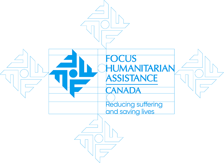
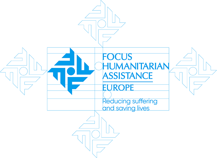
The illustration below shows the correct proportional relationship between symbol and logotype, as well as the protective space around the logo of one icon. Unless otherwise specified in these guidelines, these relationships should never vary.
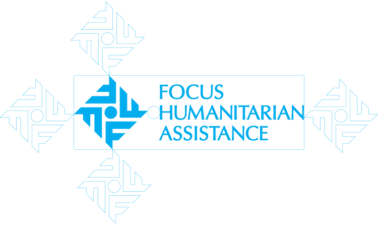
Relationship between Symbol and Logotype and Tagline
The visual below demonstrates the relationship between the three elements: symbol, logo and tagline, including mandatory protective space. These proportions should remain constant unless otherwise indicated.
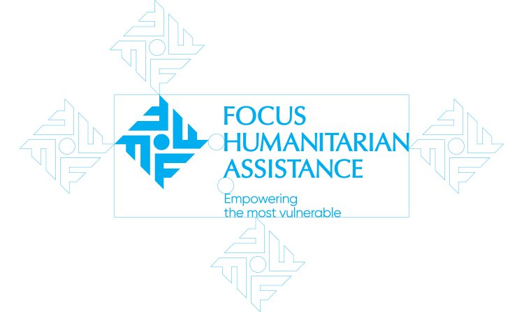
Relationship between Symbol and Logotype, Tagline and URL
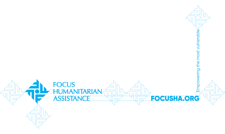
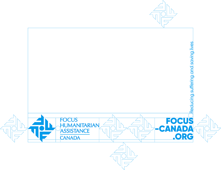
The connection between symbol, logo, tagline and URL is demonstrated below including designated protective space. These proportions should not be altered unless explicitly instructed.
Focus Humanitarian Assistance operates in Asia, Africa, Europe, and North America, helping support the vulnerable in over 30 countries across the globe. They are supported by our three affiliates: FOCUS USA, FOCUS Canada, and FOCUS Europe.
Relationship between Symbol and Logotype, Tagline and URL
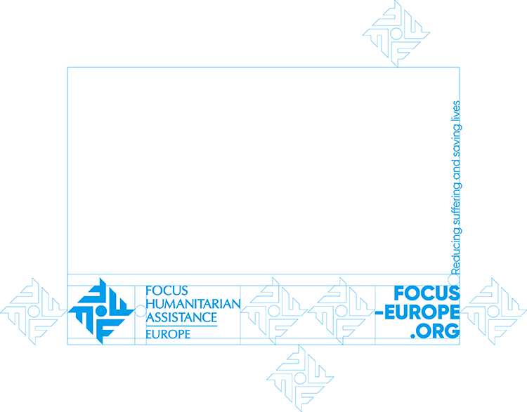
The illustration below shows the correct proportional relationship between symbol and logotype. As well as the protectice space around the logo of one icon. Unless otherwise specified in these guidelines, these relationships should never vary.
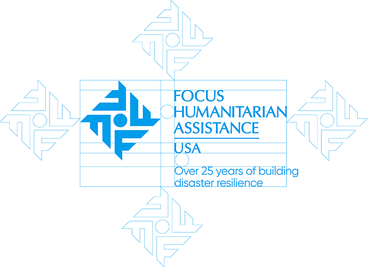

Relationship Symbol, Logo, and URL/Tagline
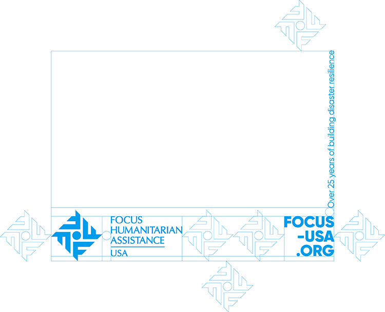
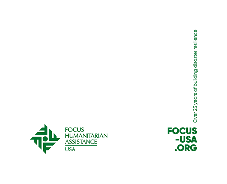
The URL and tagline only appear when the logo is used within marketing material. As well, the protective space between the logo and the URL is a minimum of two icons. Unless otherwise specified in these guidelines, these relationships should never vary.
Click the button below to get download access
BRAND GUIDELINES